Finding & following the true nature of a house
Some houses have to be helped to find their true nature. Others have nothing but their own inherent style and ooze existing character. For these properties, the only thing to do is follow their lead.
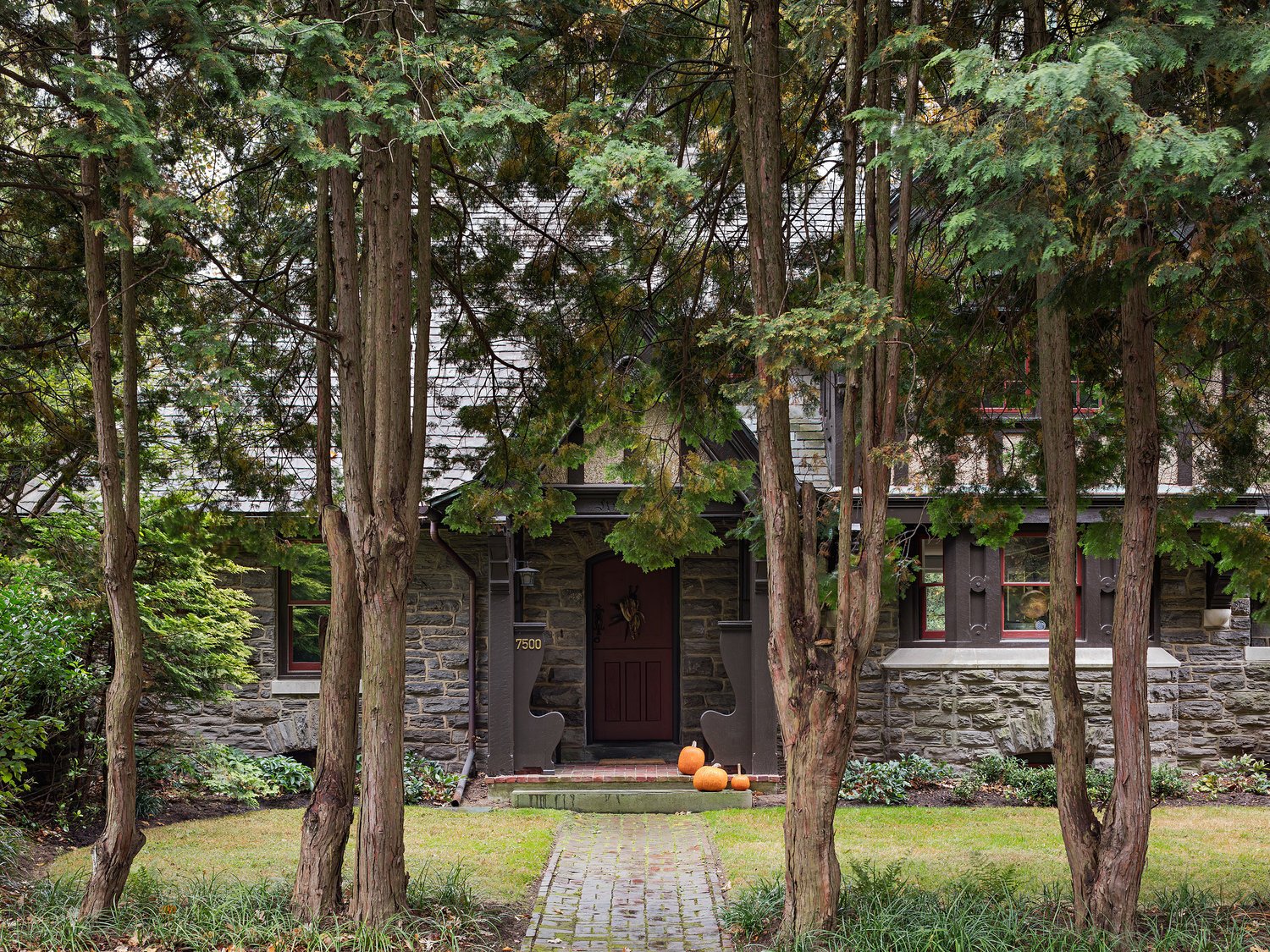
Just on the Chestnut Hill side of the McCallum Street bridge is the Cresheim Cottage. It sits at the top of one of the most beautiful private roads in the city bordering Fairmount Park. The home was in need of a complete renovation when our client, a native Philadelphian living in New York, purchased it as a weekend retreat.
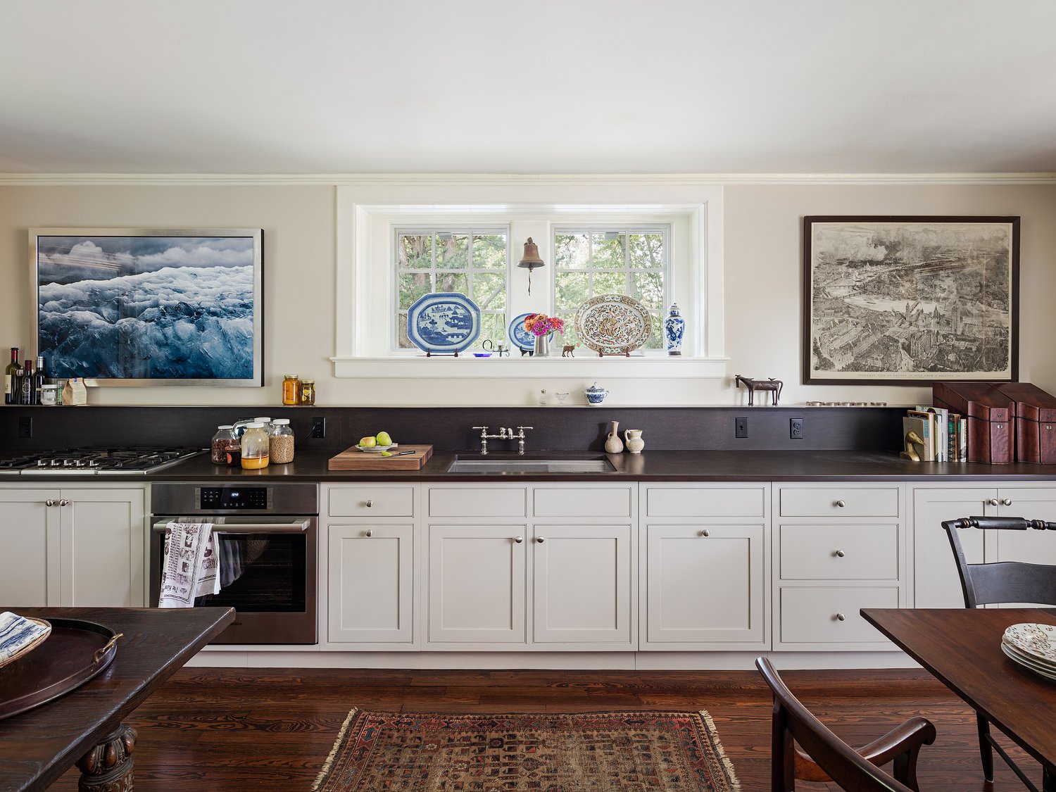
We wanted the kitchen to integrate seamlessly into the history of the house and not give away its newness with any of the tell-tale signs of a kitchen from this era. For example, instead of an island with stools, we used an antique wooden table. We also used a tall, elaborately-carved Elizabethan cabinet for storage, which allowed room for larger art pieces over the counters instead of upper cabinets. Because our client told us that the only thing he would ever cook in the kitchen would be a salad, we even decided to forgo a hood over the stove and opted instead for an in-counter retractable downdraft vent, which rises just under a slim shelf that sits just above the PaperStone countertop bumper. I love to cook, and was worried that the downdraft would not be sufficient if our client were to fall in love with a carnivore and steaks were on the menu. We were promised that the draw would be strong and this has proven to be the case.
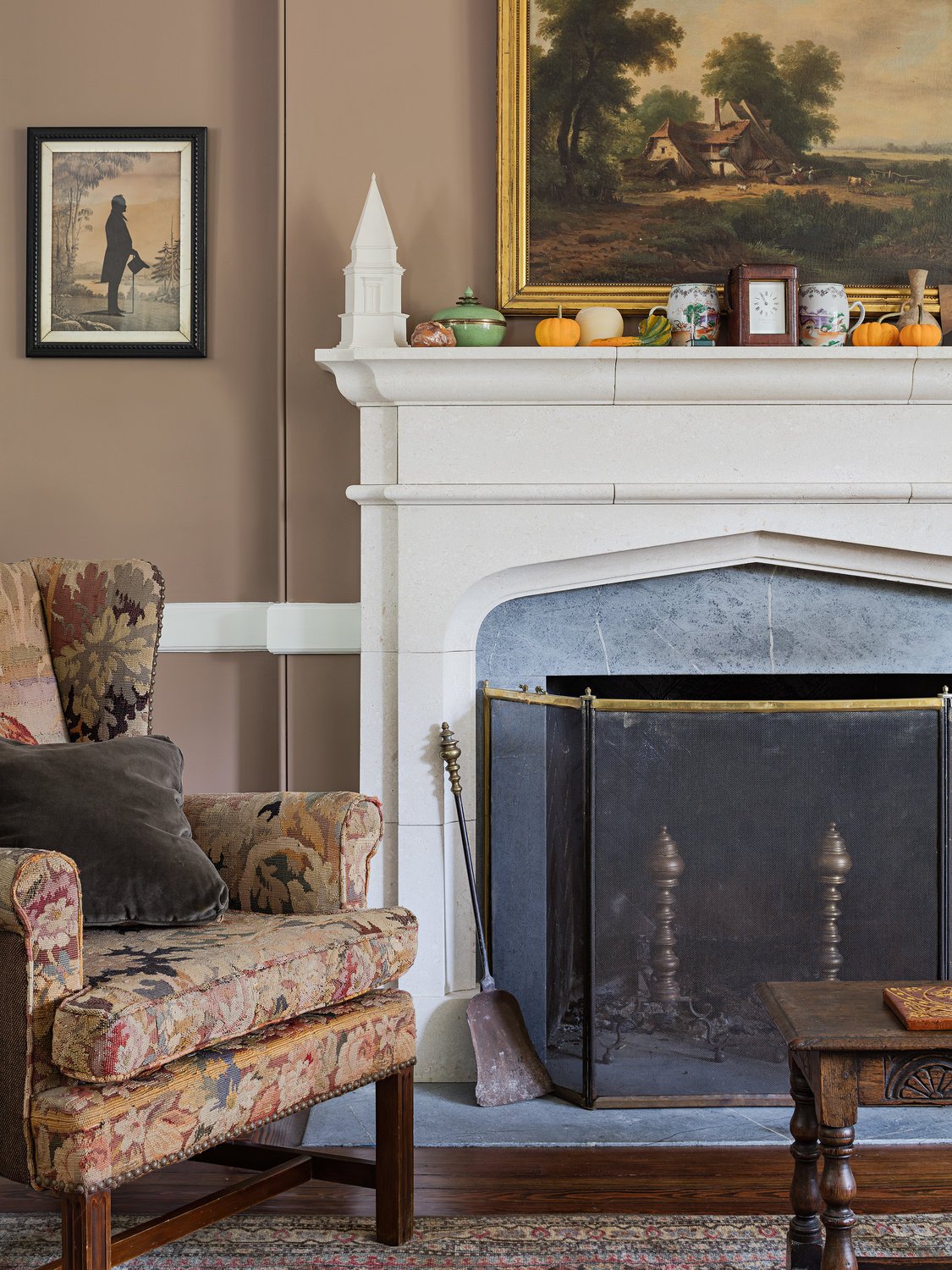
Surprisingly, the house had no fireplace, and a gas fireplace was clearly not going to be an option for this historic treasure of a home. Yet getting a wood-burning flue chimney to run through the existing structure presented a complicated engineering challenge. Our contractor, Dixon Shay of Shay Construction, managed that challenge with grace. Every part of the new fireplace is actually new – but looking at the image today it truly looks as if it has always been there.
We used salvaged encaustic tile for the front foyer, and employed my age-old trick of using dark grout in order to make all the tiled areas look old and original. We paired that entry tile with Timorous Beasties' oversized thistle-patterned wallpaper. The larger graphic size of the thistles gives them a medieval dragon-like characteristic.
For the exterior trim, we paired a soft sable brown with a rusty red just on the very inner window trim and mullions, blending the window’s softest peek of color with the original exterior patterned shingles.
Everything came together on this project – the taste of the client, the art and furnishings he owned, the expertise of the contractor, and the home itself.
I have tremendous pride in having been a contributor to this effort. I do feel like houses can talk if you are quiet enough to listen. And I believe this house said “Thank You.”


