A Modern Update for a Mid-Century Treasure
“Space becomes more of an exciting entity when it is allowed to exist purely for the pleasure of experiencing it.” -Arthur Tofani, 1958
Perhaps while on your way to C&C Creamery, you may have noticed a mid-century treasure on Hermit Street just above Henry Avenue. Built in 1949 by the Italian Architect Arthur Tofani, this home was designed smack dab in the middle of the mid-century movement. This style, which spanned from approximately 1930 to 1960, is known for its clean organic natural lines and lack of embellishment. Done well, it results in foundational design that is both distinctive and timeless.
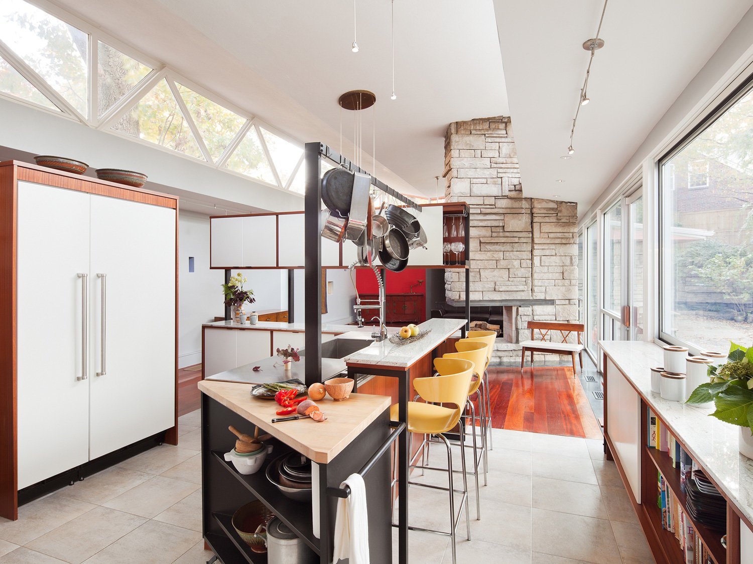
As popular as mid-century modern is now, homes from this period often need to be refreshed and updated. Despite their charm, after 65 years of use, the kitchen and bathrooms at the Hermit Street residence were no longer functional.
So Studio IQL was hired to usher them into the modern age while preserving the original design intentions. As a designer with respect for the historic value and integrity of the original design, I was also personally committed to updating the home without destroying its inherent character.
Our first challenge was immediately apparent as soon as we walked inside the main entrance. Few, if any, walls in the entire house meet at right angles. This is not a bad thing. It makes visiting this home like strolling into a cubist painting, with strong lines that define the open spaces that lie between.
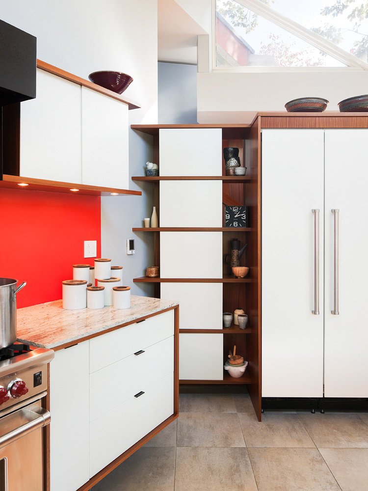
While the unique angles of the structure produced issues that could be viewed as potential design obstacles, we saw them as opportunities that could be enhanced with custom millwork and creative problem-solving. This is how we turned small spaces in obtuse corners into storage areas.
One of our first priorities was to replace the original windows, doors, and appliances with new units that would integrate seamlessly into the existing style of the house. Sometimes this meant finding components that matched the original vision as nearly as possible. In some areas we had to add components that were in the spirit of its natural design.
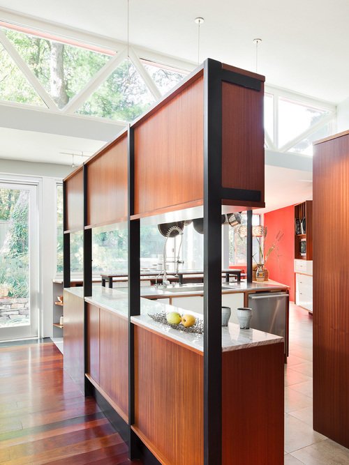
Then there were the countertops, cabinets and closets – all of which needed to be updated with either custom millwork or novel applications. To create additional upper cabinet storage, for example, we designed steel brackets to hold a bank of upper cabinets that also served to divide the dining area from the kitchen.
Arthur Tofani created spaces that were meant to be enjoyed and appreciated simply by being inside them. This home was elegant and sophisticated before its update. The spaces that were originally created feel like they are part of a whole. Perhaps that is because the closer one looks, the more one sees. Each diagonal leads somewhere new, or sets something apart, and adds to the experience of simply being present.
Sometimes in life we don’t have to start over. We just have to extend and enhance what is already here.


