From Builder Grade to Beautiful
From time to time, we have clients coming to us to solve what we have come to call “builder grade” problems. Usually, these are houses built by developers within the last 20 years that try to take advantage of a hot location. Laden with features, but devoid of thought or soul, these structures need remediation to reach their potential as homes.
Telltale signs of builder grade houses include the ubiquitous use of narrow, three-inch composite trim, the inclusion of faux stone tiles, and a plethora of cold spectrum “high hat” lights liberally puncturing the ceilings. They lack integrity because the people who made them were focused on making money instead of homes. Often the hardware selections and plumbing fixtures look as if somebody got a deal through buying them in bulk.
When Genny and Frank relocated to Philadelphia in the spring of 2021, it was a seller’s market. After being outbid during several attempts to land a house, they finally were able to purchase a Center City property built in 2005. Besides having a terrific location, the structure had lots of natural light, and – well, that is about it. The other feature, its tax abatement, had expired.
In short, the house was truly builder grade. The good part was that it also had potential. After all, lots of natural light is nothing to sneer at. The only way to move forward was to do a full scale renovation of the property. This was a large project which required many adjustments.
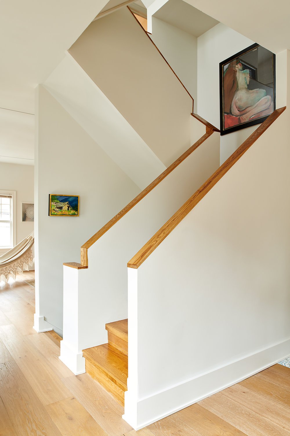
Upon entering the home one could not ignore the gawky central staircase with a colonial railing. Tiny interior window openings peeped out onto the first floor from the landing. The style was simply out of place in a central corridor otherwise filled with natural light. The implicit message was “Go directly to jail. Do not pass Go. Do not collect your thoughts.”
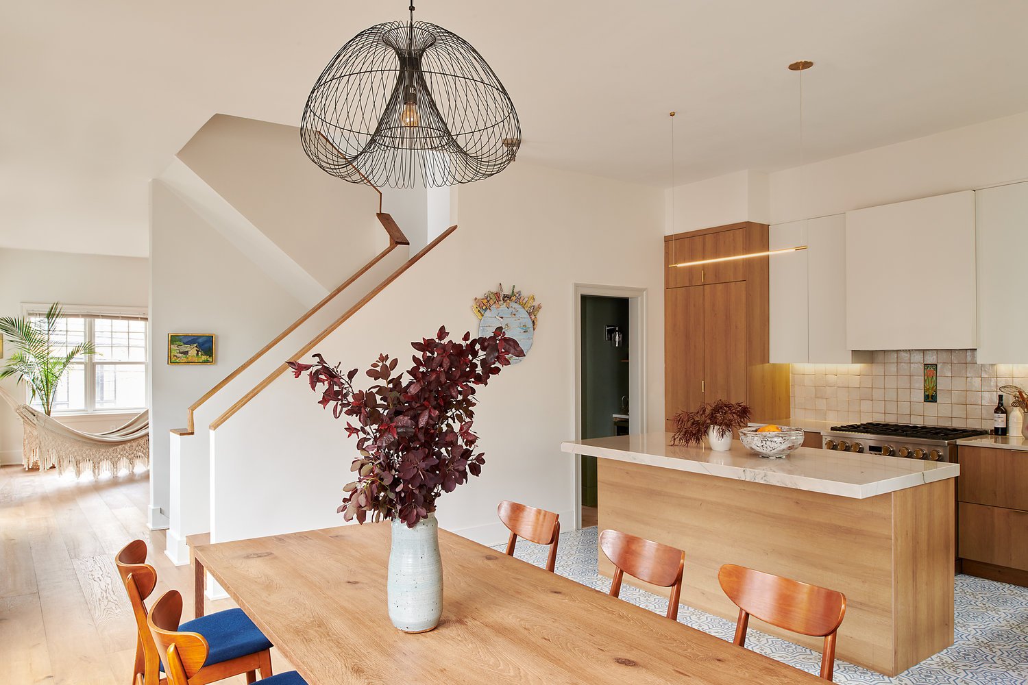
What was needed in this space was something more sleek and modern. For that reason we chose to replace the railing with a solid material half-wall. This gives the house a calmer, gallery-like atmosphere that accentuates its natural openness rather than temporarily imprisoning any guest who ascends to the second level.
We also created a small hallway directly behind the stairs. Formerly, this space was taken up by a powder room that opened directly onto the living area. This change improved the flow of movement throughout the first floor, added light to the living area, and most importantly moved the powder room door so that it opened out onto the hallway.
It is still a mystery to me why the builder thought it was a good idea to place the powder room in its original location. They must have had a checklist of features they wanted to include and were oblivious to the fact that people would actually live in the house after purchasing it.
The central lesson of Genny and Frank’s home is that every house has potential. We can reimagine any kind of space to suit how we live our own lives – even those compromised by someone else’s economic priorities.


